Workflow_automation
INTRODUCTION
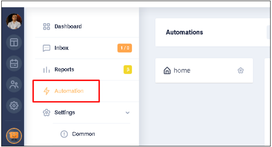
Each chatbot contains automation modules. These modules are: INTENT, TRIGGER and WORKFLOW. This document provides a detailed description of the user's work with each module. Screenshots have been added for visualization and better understanding of the written text. To go to the automation modules, click the AUTOMATION tab on the left menu.
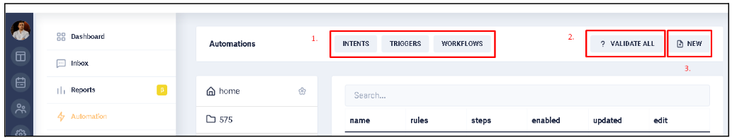
When the AUTOMATION tab is open, the following buttons are displayed at the top of the window: INTENTS, TRIGGERS, WORKFLOWS (1* Hereafter: this number indicates the image element to which the text is referencing.). There is also a button to validate the automation module - VALIDATE ALL (2) and a button to create a new automation module - NEW (3).
Screenshots have been added for better understanding of the written text. See the relevant sections for more details.
WORKFLOWS
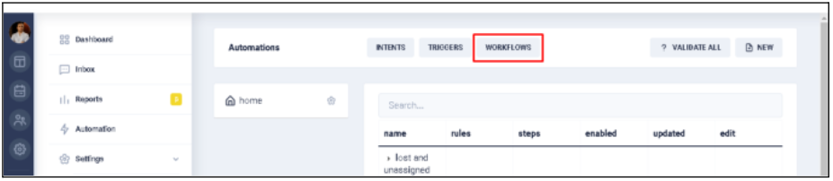
The workflow in the graphical diagram shows exactly what should happen when an intention or trigger is triggered. For example, it can show what the system should do if the user opens the bot. Or what the reaction of the system should be if the user selects one of the suggested conversation paths, etc. To go to the Workflow, click the WORKFLOW button at the top of the AUTOMATION block.
Workflows are modules of system automation, which are the most basic in constructing the logic of the bot. These modules perform a set of functions programmed by the bot user. When conditions and rules are built, on the occurrence (execution) of which it is necessary that some actions take place, it is the WorkFlow will deal with the execution of these actions. The structure of each WorkFlow contains:
- start element (START);
- end element (END);
- internal elements (DIALOG).
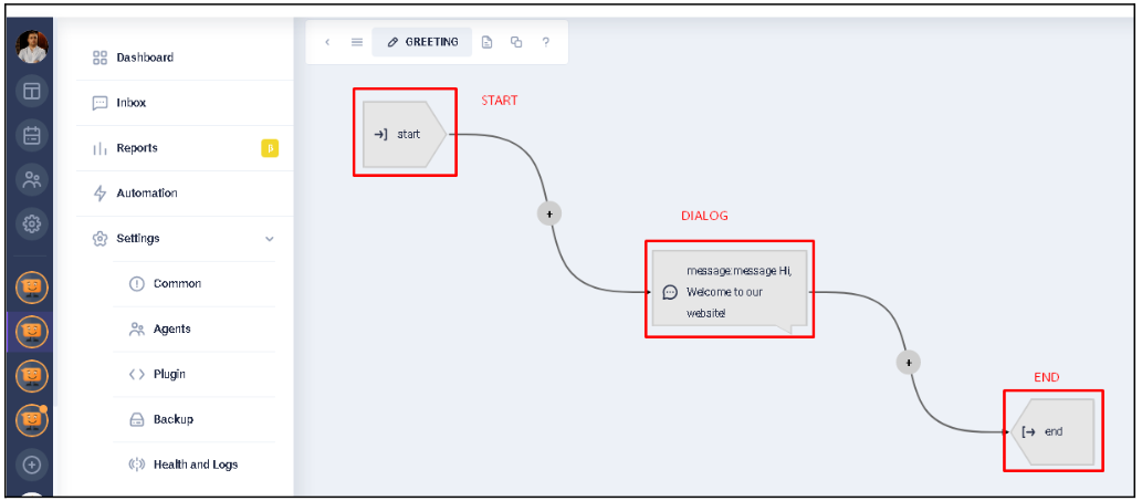
From these elements the Workflow logic (functions) are constructed as links in a chain. These elements can be configured according to the needs of the user. It is possible to specify the color of an element for its visual identification in the scheme. But this is an optional parameter. Each of the internal elements has both a set of common attributes, and a set of attributes unique to the configuration of a particular element. Also, for clarity of display on the Workflow diagram, each of the types of elements has visually its own, specific form of display.
Common attributes of internal elements include:- Name field. The name (title) of the element for easy identification in the WorkFlow schema;
- Enabled switcher. Switch that allows to make the item active or inactive (On/Off).
When set to Off there appears an additional field Next when disabled with the indication of the element to which the transition is made when the current element is disabled ("pass-through"); - Next field. The field indicates the next element to which the transition occurs, after the current element function. The exceptions are: "fork-intents", "fork-buttons", "fork-conditions", "fork-workflow". These elements don’t have a single next element for transition, because the analysis of the result of the function of the current element is used with the indication, depending on the result, of the corresponding transition (fork, branching).
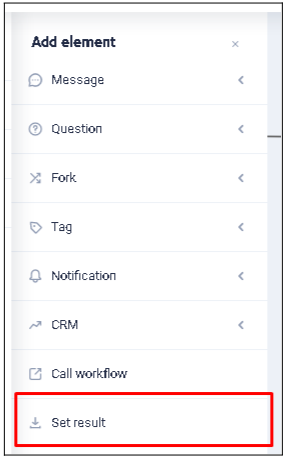
To add a new internal element, select the "+" sign with the mouse cursor at the place where the element is supposed to be inserted. Then select the desired type of element in the displayed list.

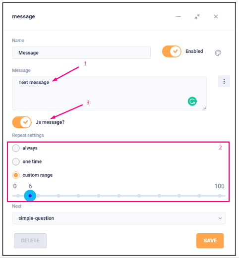
1: Message
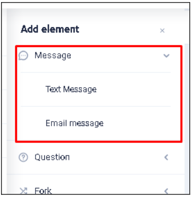
This is the item that displays the message specified in it (1). There is a setting for how often this message is repeated (displayed) (2):
- always
- one time
- custom range
There is also a setting to display the message as a JavaScript window (3) with the message (to do this, set the "Js message" switch to "On").
2: Question
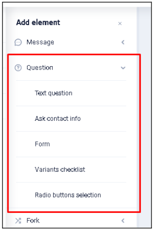
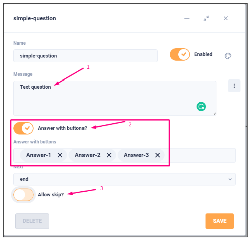
2.1: Text question
This is the element that displays the text (1) of the question to the visitor and expects the visitor to respond with a text message. If the answer option with buttons (2) is enabled in the settings, instead of the usual free text answer, the text that will be displayed on the buttons offered for answer is listed in the corresponding field. There is a setting "Allow skip?" (3), which in the "On" position allows you to skip waiting for a response from the user and, in this case, redirect follow the path specified in the "Next on skip" field.
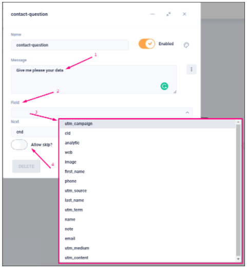
2.2: Ask contact info
This is an element that is used to ask (1) the user for his contact information and store it in the visitor's card. The response the visitor gives is written to the specified field (2) of the visitor's card, and the list of available fields (3) is opened for selection below. There is a setting "Allow skip?" (4), which in the "On" position allows you to skip waiting for a response from the user and, in this case, redirect the following by another (specified in the "Next on skip") path. When you use this element, only one field in the card is filled once. If you need to fill in additional fields, add one more element like this one after this one, specify the question and select the appropriate field to fill in.
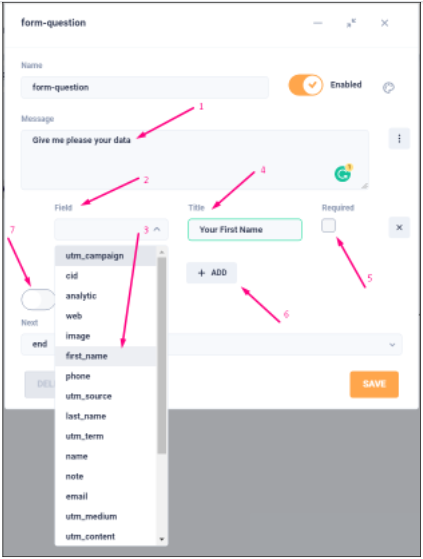
2.3: Form
This is an element that is functionally similar to the previous one ("Ask contact info"), but allows you to design a form for filling many visitor card fields at once. Here, as in the previous element, the text of the data filling request (1), the field (2) to be filled, which is selected from the available list of fields (3), the text description of this field (4), the flag "must fill" each of the listed fields (6). If you need to add another field to the form, use the "Add" button (6), select the field from the list, add a description and set "mandatory" for its indication. There is a setting "Allow skip?" (7), which in the "On" position allows you to skip waiting for a response from the user and, in this case, redirect the following by another (specified in the "Next on skip") path.
3: Fork
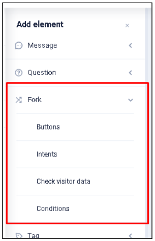
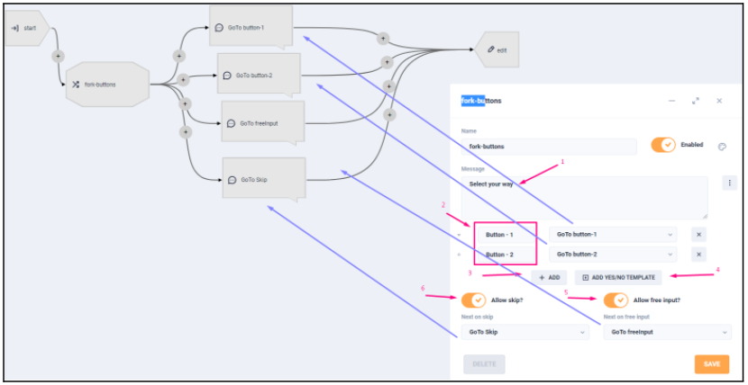
3.1 Fork-buttons
This is a branching element of the logical process structure (Workflow), which uses the selection of answer buttons from those offered to the visitor for analysis. Here you can specify the text of the answer choice question-proposal (1), the list of displayed buttons (2) with the text for these buttons and the correspondence to the transitions to the internal elements when selecting a certain answer choice. If you select button (4), all current button choices will be replaced by a "Yes/No" button pattern (2 buttons with corresponding text will be added and you must specify the items to navigate to these buttons). In addition to selecting answer options with buttons, there is an option to enable (5) the text field for the answer, and you must also specify the item to which the transition will be made if the visitor does not answer with buttons, but uses this field to enter the answer. There is a setting "Allow skip?" (6), which in the "On" position allows you to skip waiting for a response from the user and, in this case, redirect follow-up to another (specified in the field "Next on skip") path.
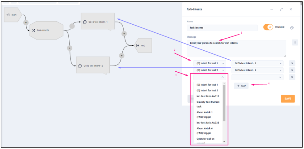
3.2: Fork-intents
This is a branching element of the logical process structure (Workflow), which uses a check of the text the visitor leads with the content of the Intents for analysis and if there is a sufficient match, a transition to the corresponding internal element is made. Here it is possible to specify the question-proposal text (1), the list of Intents (2) to search for a match of the entered message and match transitions to internal elements. To add a new Intent to the list of investigated, it is enough to press the "Add" button (4) and select the necessary one from the drop-down list of available Intents. In this element, there is no possibility to skip it (be careful when using it).
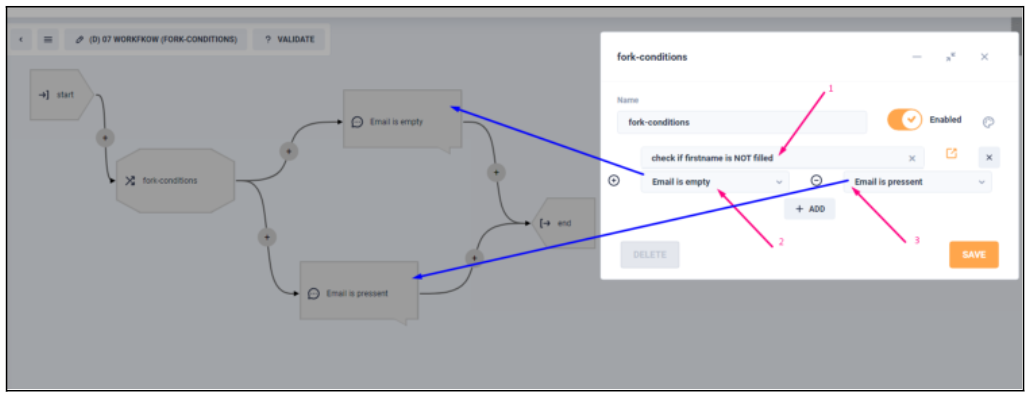
3.3: Fork-conditions
This is a branching element of the logical process structure (Workflow), which uses the result of the Trigger (1) specified in the settings for analysis. Depending on the value of this Trigger, a transition is made to the corresponding internal element. Here it is possible to choose among the Triggers (1) available in the system and specify the ways of transition with values TRUE "+" (2) or FALSE "-" (3). In this element there is no possibility to skip it (be careful when using it) and it is obligatory to specify both options of check for further transition and specified element.
4: Tag
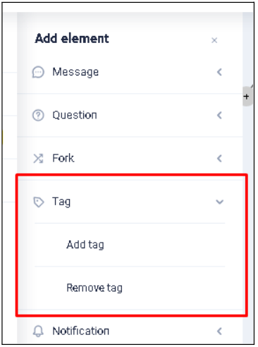
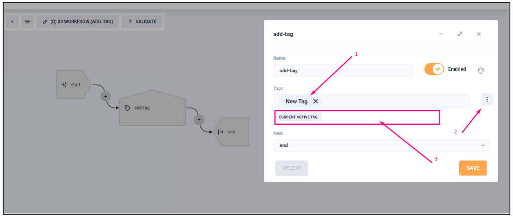
4.1: Add tag
This is an element that adds to the account of the current visitor a specified tag (1) or group of tags. It is possible to select several of the tags that are available within the current bot or specify one that is not yet in the list of available. When you select button (2) - displays a list (3) available (existing) in the current bot tags, which, if selected, can be added.
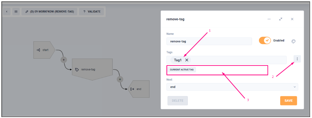
4.2: Remove tag
This item removes a tag (1) or a group of tags specified in the settings from the current visitor's account. It is possible to select several of the tags that are available within the current bot or specify one that is not yet in the list of available. When you select button (2) - displays a list (3) available (existing) in the current bot tags that, when selected, can be removed.
5: Notification
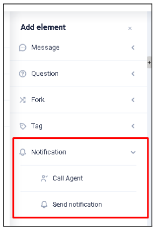
5.1: Call agent
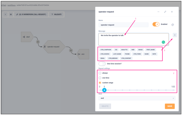
This is the element that displays the message (1) indicated in it before inviting (creating a request in the system) to the operator's dialog. There is a setting for how often this item is activated (2):
- always.
- one time.
- custom range. - how many times (from 0 to 100) the operator request will be initialized.
In the settings of the displayed message you can specify the values of service fields of the visitor's account. To do this, select the button (3) and in the list that appears select the desired field name (such use is relevant, for example, to create a personalized appeal if the user has a filled field "first_name").
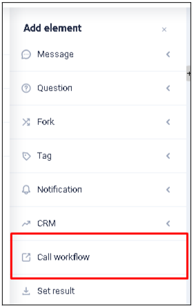
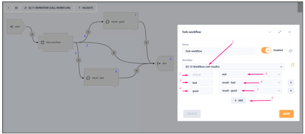
6: Call-workflow (fork-workflow)
This is a branching element of the logical process structure (Workflow) that uses the result obtained from the Workflow specified in the settings (1) for analysis. Depending on the value of this result a transition is made to the corresponding internal element. Here it is possible to select from the available Workflows (1) and specify the transition paths at possible values:
- (3) > переход (6)
- (4) > переход (7)
The values are set in the marked (1) Workflow (this will be explained in the next element). If the called Workflow has no explicitly specified result (ended by reaching the "End" element), the transition will be executed according to the result condition "default" (2) > transition (5). The distinctive feature is that when selecting a particular Workflow, all of its possible results are displayed in the transition selection list. But it is still possible to add more processing results (if you have changed the structure of the Workflow (1)) and just select the button (8) for this. In this element there is no possibility to skip it (be careful when using it).
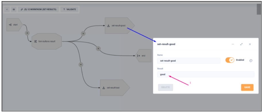
7: Set result
This is the element that sets the result (1) of the current Workflow. As you can see from the example there can be several such results (their processing and analysis, discussed in the previous element). After assigning the result, the current Workflow is terminated (also called "implicit End").
To delete an internal element, put the mouse cursor on the element to be deleted and select "remove". If you want to edit an existing element, select "edit" after hovering the cursor.