Forms
GENERAL PRINCIPLES
One of the features of our platform is that we provide customers with advanced features on forms that a visitor can fill out on your website. There is no need to create a separate, complex automation. For example, if you have a button on your website (e.g., Get a demo), when the user clicks on it, the form appears, where he can fill in the fields and leave a message, etc.
Using Message center, you will see all the data about the user, which will be automatically displayed in the CRM. It's worth mentioning that with this tool, not only is it possible to send the visitor's data to the CRM, but also to customize the appearance of the form according to your preferences.
SETTING UP AND EDITING FORMS
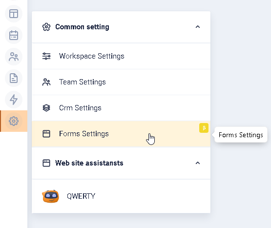
To create a Form that will be displayed when a visitor clicks on a button on your website, go to settings. To do this, click on the Settings icon in the left-hand menu. In the box that appears, click on Common setting, and in the drop-down list click on Form settings.
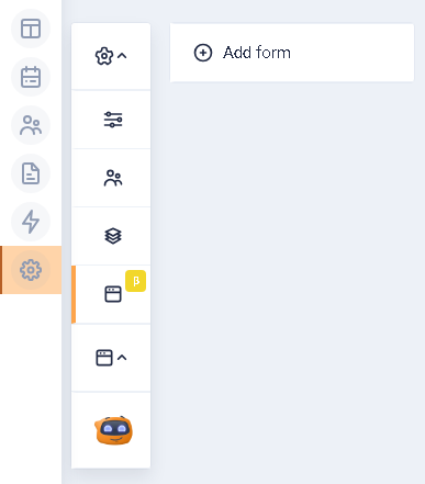
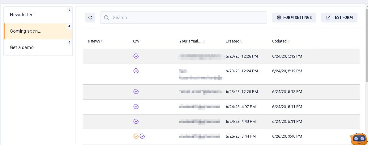
You will be shown the Add form button and a list of previously configured forms, if any.
There are no forms created
There are forms that have been created

Clicking the Add form button will display the form configuration items. By default, the MAIN CONFIG section will be active. The items at the top of the form settings will be displayed if any section is active.
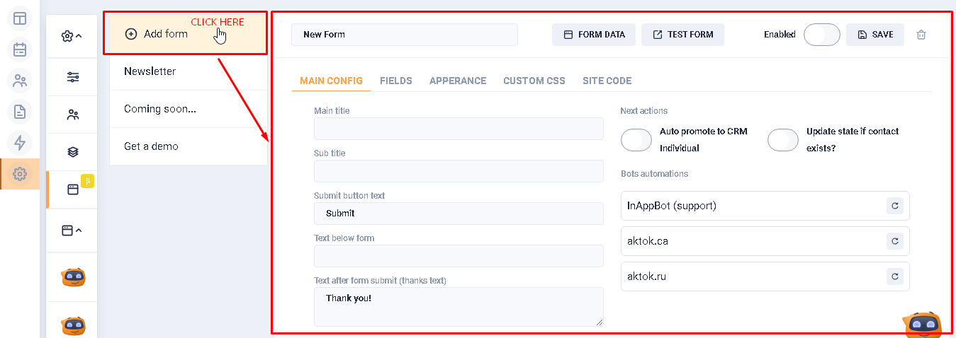
Elements at the top of the form settings box
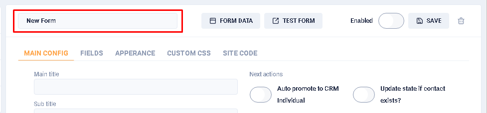
- Form name field:
In this field, the user must specify the name of the form. By default, the field is filled with the phrase "New Form". There are no entry restrictions.
- Form data button:

When creating a new form, clicking on this button takes user to the Message center, but the user will be presented with an empty screen.
When editing an existing form, there is also a transition to the Message center, where the user is prompted to select one of the existing forms.
Clicking on a particular entry in the list will display a popup with expanded information about the visitor. The popup has:
- button to go to the visitor's object (card) in the CRM (1).
- button to go to the profile with the data on the visit (2).
- button to go to Inbox, which contains the history of communication between the visitor and the bot (3).
- button to open/reveal technical information about the visitor (4).

To go back to the create/edit form page, click the Form settings button.

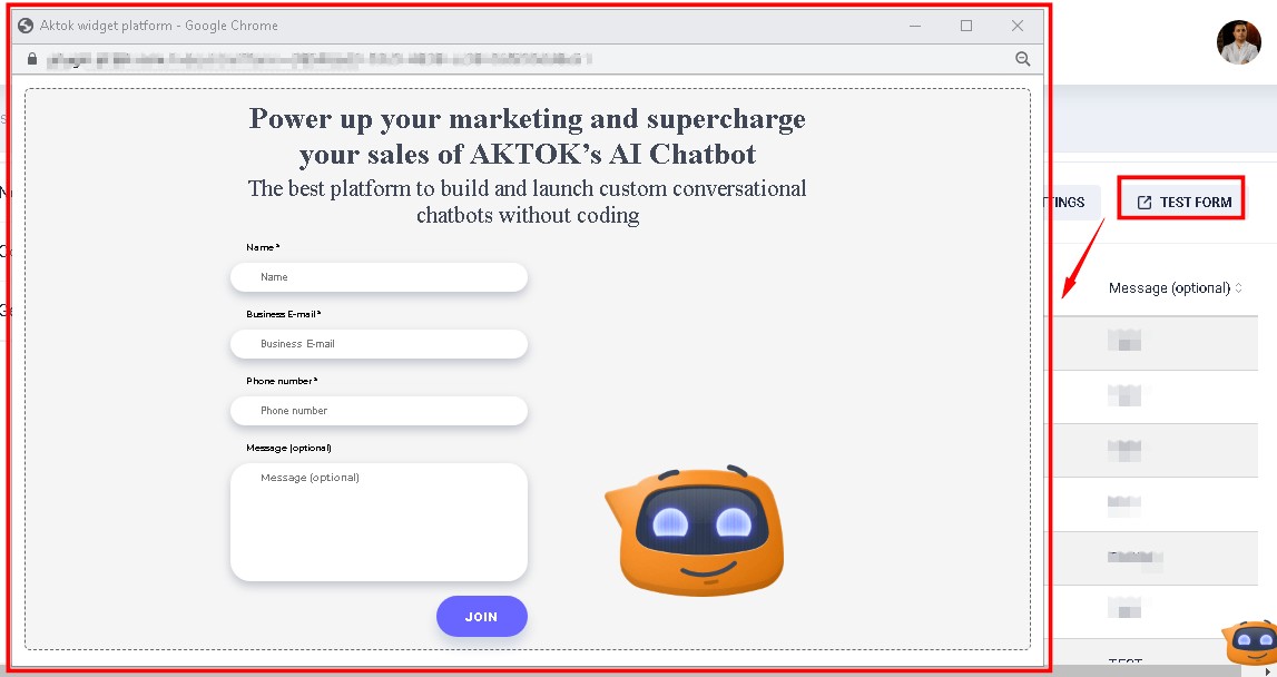
- Button "Test form":
When the user clicks this button, a preview sketch of the user-created form is displayed in a separate window.
- Form activity switch:
By default, the switch is in the inactive state. When it is activated, the data specified in the form will be transmitted to the CRM. If the switch is inactive, the form will not be displayed to the visitor.

- Save button:
When the user clicks on this button, all the data that the user has entered in the fields, etc. is saved. It is worth noting that autosave is not available.

- Delete button:
When the user clicks this button, a notification appears asking the user to confirm the deletion of the form. The notification has two buttons: Cancel and Confirm. When the user clicks on the checkbox, neither deletion nor saving of the form takes place, but the user is shown a block of form settings at the moment of clicking on the button of deletion.

Sections of the form settings on the UI
- MAIN CONFIG section:
This section specifies the text components of the form creation or editing block (form name, buttons, additional text, and text after the button is clicked). The section is active by default.
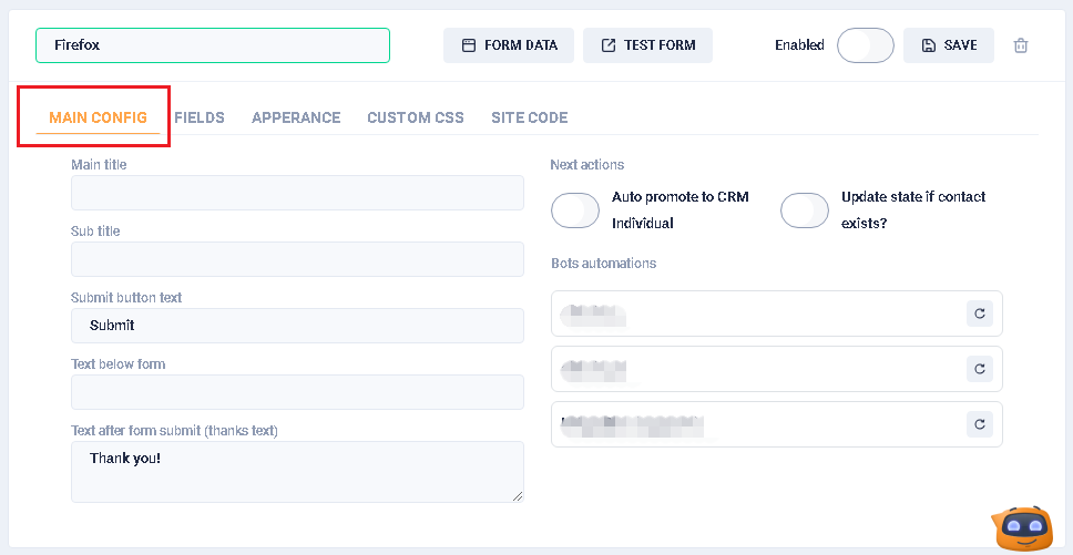
Section fields:
- Main title. In this field, the user specifies the name of the form on the website. The name will be located at the top of the form. There are no limitations on the entered characters. The field is optional.
- Subtitle. Under the form name field, there is a field for clarification, additional text, explanation, etc. There are no restrictions on the characters that can be entered. The field is optional.
- Submit button text. This field specifies the name of the button on which data from the form will be sent to the system. By default, the field is filled with the word "Submit". There are no limitations on the number of entered symbols. The field is optional.
- Text below form. This is an additional field for notes, explanations, etc., which is located below the submit button. It is not filled in by default. There are no character restrictions. The field is optional.
- Text after form submit (thanks text). The text that is displayed to the visitor when it clicks on the submit button from the form. The default phrase is "Thank you!". There is no character limit. The field is optional.

Next actions block.
In this block, the user can activate the Auto promote to CRM Individual and Update state if a contact exists? switches and specify what should happen after the visitor has clicked on the form submission button.
If the switch Auto promote to CRM Individual is in the active state, then appears the field New contact state, in which the user can select the status of the contact, which will be assigned to him when creating his object (card) in the CRM system.
If the Update state if contact exists?" switch is active, then, provided that the contact exists, its status in the object (card) will be updated according to the one specified in this field.
If the Auto promote to CRM Individual switch is inactive and the Update state if contact exists? switch is active, then, if the contact exists, its status in the object (card) will be updated according to the one specified in this field. If the contact doesn't exist, nothing will happen.
A situation where Auto promote to CRM Individual and Update state if a contact exists? switches aren't active.

A situation where Auto promote to CRM Individual and Update state if a contact exists? switches are active.

Add Bot Automations.
This block contains a list of chatbots that are available in the system. The user can select the desired bot and click on the circular arrow button. After that it will see a field with a drop-down list of automations of this bot. It is possible to select only one automation.
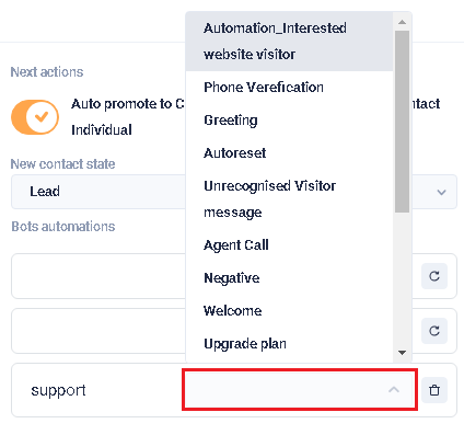
If automation is specified for any bot in the block, then after the visitor has filled out and submitted the form, the automation selected by him is launched. For example, the plugin displays a welcome message or prompts to take a survey, etc.
- FIELDS section:
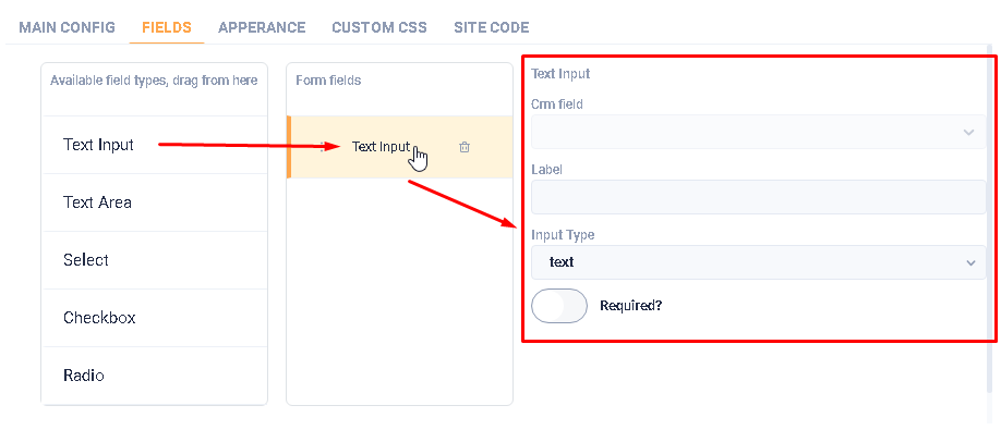
In this section, the user can specify the types of fields to be filled in the form. There are five types in total, which are located in the left column Available field types, drag from here. For the field to be displayed on the form, user must drag any field type to the right column of Form fields.

By dragging the field type to the right column, a form for the description of this type appears.
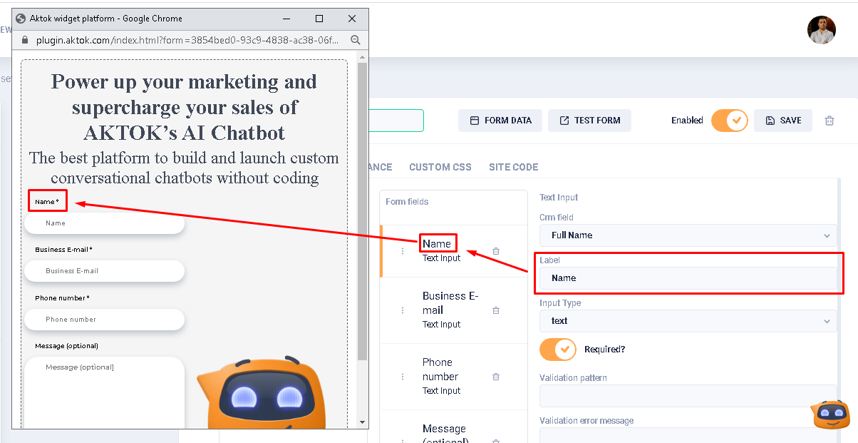
For the Text imput type, it is necessary to fill in the CRM field, Label, Input Type fields, as well as specify the obligation to fill it out on the form.
For the Text area type, it is necessary to fill in the CRM field, Label field, as well as specify the obligation to fill it in on the form.
For the Select type, user need to fill in the CRM field, Label, Variants fields, as well as specify the possibility of multiselection and the obligation to fill it out on the form.
For Checkbox and Radio types, it is necessary to fill in the CRM field, Label, Variants fields, as well as to specify their obligatory filling on the form.
In the right block of Form fields, it is possible to drag and drop fields. Note that no confirmation message appears when you delete a field.
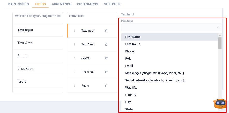
In the block of editing form fields, when user clicks on the CRM field, a drop-down list with all the field names (variables) that are available in the system is displayed.
The Label field specifies the name of the field that will be displayed on the form, as well as in the Form fields column.
In the Input Type field select what type should be entered *(text - only text, number - only numbers, email - only in email format, url - in url format, tel - in international telephone number format, date - only date format, time - only time format, datetime - both date and time format, password - in password format).

In the Variants field, specify the variants (words, numbers, etc.) that the user can mark in the form. To do this, enter the variant name in the field and click Enter. There are no restrictions on the number of variants, or on the nature of the characters.

The Multiple choices switch allows the user to select two or more options from Variants field. The Required? switch allows users to specify the field as required.

When the required switch is active, two fields appear: Validation pattern and Validation error message. The Validation pattern field is still under construction.
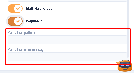
In the Validation error message field the user can specify the text to be displayed to the user when invalid data is entered.

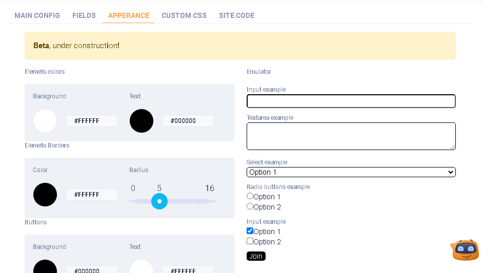
- APPEARANCE section:
Beta, under construction!
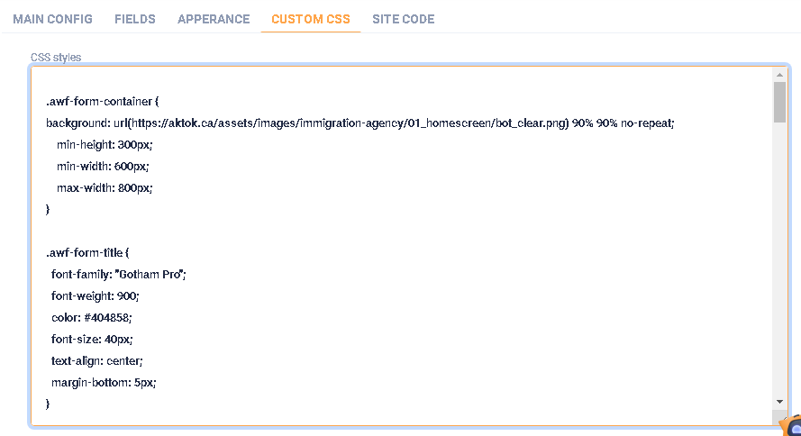
- CUSTOM CSS section:
In this section, the user, with knowledge of CSS styles, can adjust the appearance of the form, ie, choose the necessary fonts, colors, etc.
- SITE CODE section:
This section contains the script that must be added to the existing code of the user's web site. In particular, the Head tag zone block specifies the script that must be inserted in the HEAD block in the html code. And the Form on page block specifies the script that must be inserted in the BODY block in the html code. Attention! Access to the code is required to perform the above actions.
